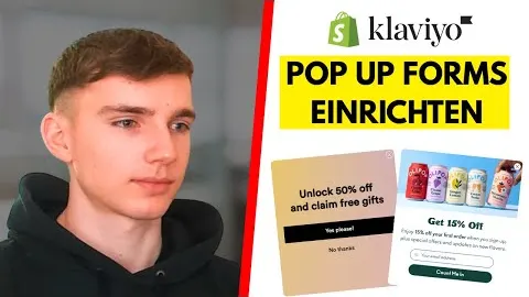
The average online store converts 2 to 3% of its visitors. So 97 out of 100 people leave without buying. Your pop-up is the one shot to get their email before they're gone, and every extra subscriber feeds your welcome flow.
Start with the offer
The offer is the main reason people sign up. Match it to your average order value:
| Average order value | Offer that tends to work |
|---|---|
| Under $50 | 10 to 15% off |
| $50 to $100 | A free gift with the first order |
| Over $100 | Early access or exclusive content |
Design and copy
- People decide in about three seconds. The headline is the biggest thing on the pop-up, the button the second biggest.
- Headline in three to five words, only about the offer: "You've got 20% off".
- The button says what they get: "Get 20% off", never "Continue" or "Submit".
- Ask for the email only. Every extra field costs you sign-ups.
- Design for the phone first. That's where most of your traffic is.
Timing and targeting
Show it 6 to 10 seconds after someone lands. Earlier feels pushy, later and many visitors are already gone. And exclude people who are already in Klaviyo, so your customers don't get asked again.
Use a multi-step pop-up
- A simple yes or no question. "Want 20% off your first order?" A small yes makes the next step easier.
- Email only.
- SMS as an optional extra, after the email is in.
- Success screen with the code, right there, so they can shop immediately.
Test it properly
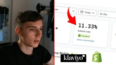
Change one thing at a time and give every version at least 1,000 views before you decide. Test the offer first, then the design, then the timing. The two numbers to watch are the pop-up's sign-up rate and how many of those new subscribers place a first order in the welcome flow.
Watch Leon walk through it
Free on YouTube, in German.