Open the promotions tab of any inbox and scroll for ten seconds. Banner, product grid, button, repeat. A plain text email from a real person stands out against all of that, which is exactly why it works. But it isn't the right call for every send.
When a plain text email wins
Plain text emails feel like a message from a person. That lowers the guard people put up when they see a sale banner. We use plain text when the email needs:
- Trust, or a sense that this is legit
- Urgency without pressure
- Objection handling in a conversational tone
- A founder or personal touch
In practice that means sale reminders in the middle of a sale, last chance pushes, founder recommendations, check-ins in the welcome or cart flow, post-purchase notes from the founder, soft win-backs and credit expiry reminders.
When a designed email wins
Designed emails win when people need to see something. Product browsing, or a layout with several proof points stacked on top of each other. Launches and big sale kickoffs usually go here too, because the offer and the products need to land in the first glance.
| The email needs to... | Format we pick |
|---|---|
| Feel personal, from the founder | Plain text |
| Remind people a sale ends tonight | Plain text |
| Handle a hesitation in a cart or checkout flow | Plain text |
| Show a collection or a product grid | Designed |
| Compare you against alternatives | Designed |
| Stack reviews, badges and product shots | Designed |
How we write a plain text email
Before writing, we define the one job. Get them to use the code, or remind them the sale ends tonight. "Write a nice email" is not a job.
- Send from a person. The founder or a named team member, never a faceless brand name.
- Greet by first name, with a fallback. And test it. "Hey ," in someone's inbox kills the whole effect.
- Short paragraphs. Three short sentences max, then a break.
- Code easy to find. Bold or on its own line, never buried mid-paragraph.
- Deadline once. Repeating it makes the email feel cheap.
- CTA on its own line with arrows. There's no button, so the link needs to look clickable: Shop the sale >>>
- P.S. only when it adds something. A guarantee, a personal pick or a fact the body didn't cover.
Length depends on the job. Sale reminders and last chance emails usually land at 80 to 200 words. Educational or empathy-led emails run 150 to 300. What kills a plain text email is filler, so cut every sentence that repeats something you already said.
How we build a designed email
People decide in 2 to 3 seconds whether to keep reading, and more than 70% of them are on a phone. So every designed email we write follows the same skeleton:
- Hero. Headline and the main button, with a subheader when it helps.
- One or two sections. Reviews, a comparison, a timeline, an FAQ. We rotate the type so emails in one month don't look alike.
- Product block. Product name and a few short bullets, then the button.
Never fewer than 2 blocks and never more than 4. Each block gets 1 to 3 short sentences, usually 1 to 2. On mobile that means single column, buttons at least 44px tall, body text at 16px or larger, and every image under 150KB.
Mix them inside one campaign
Our calendars use both formats, often for the same sale. A typical split: the launch email is designed. The reminder halfway through and the last chance email go out as plain text from the founder, the last one with a short block of offer facts at the bottom. Our anniversary sale guide shows a founder plain text email that does a lot with very few lines.
Flows work the same way. Our abandoned checkout flow runs three designed emails, then ends with a founder plain text email with the subject line "Re: Your order at [Brand]". It's in the abandoned cart flow guide.
Mixing in plain text also helps beyond the single email. We recommend it for deliverability, because plain text often does better for personal sends. And the subject line has to match the format: a plain text email needs one that reads like a message, which we cover in the subject line guide.
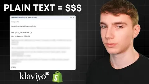
Watch Leon walk through it
Free on YouTube, in German.
Questions we get a lot
Do plain text emails perform better than designed emails?
It depends on the job. Plain text wins when the email needs trust or a personal touch. Designed wins when people need to see products, compare options or browse a collection.
How long should a plain text email be?
There is no hard limit. Sale reminders and last chance emails usually land at 80 to 200 words, and educational or empathy-led emails at 150 to 300 words.
Do plain text emails need an unsubscribe link?
Don't add your own. Klaviyo adds its own unsubscribe footer to every email, so an extra link at the bottom of the copy is just clutter.
Can a plain text email have images?
We keep them without images or templates. The whole point is that it looks like a message from a real person.