More than 70% of emails get opened on a phone, and people decide within 2 to 3 seconds whether to keep reading. So ecommerce email design starts on a phone screen, with a thumb on it. If it works there, it works on desktop too.
What good design has to get right
- One message. One offer, one main button, understood within 2 to 4 seconds. A confused reader doesn't buy.
- Built for scanning. People move through emails the way they move through a social feed. Clear hierarchy and short chunks, or they scroll on.
- Mobile first. Vertical layouts, tap targets for thumbs. We don't treat this as optional.
Mobile rules for ecommerce email design
These are the numbers our designers work with on every brand:
| Element | Rule |
|---|---|
| Layout | Single column only |
| Buttons | At least 44px high, centered |
| Body text | 16px minimum |
| Headlines | 24px or larger |
| Line height | 1.5x |
| Images | Under 150KB each, compressed |
| Fonts | Simple and clean, no decorative fonts |
Hierarchy follows size. The headline is the biggest thing in each section and body text the smallest. Check that on a real phone, because a hierarchy that looks clear on a big monitor can flatten out on mobile.
Brand consistency matters as much as the sizes. Keep the fonts and the button style identical in every send, so a subscriber recognizes the email before they even read the sender name. For ideas, we look at Milled to see how brands send over time, Really Good Emails for clean layouts and MailCharts for full flow sequences. Then we build our own version. Copying a template is how you end up looking like everyone else.
The block structure behind every designed email
Every designed campaign we write follows the same skeleton. Variety comes from the angle and the choice of section types, and the layout stays put.
- Hero block. Headline, an optional subheader, sometimes one proof line, then the button.
- Section blocks. Headline, optional subheader, the content, a button.
- Product block. Product name, a few short bullets, a button.
An email has 2 to 4 blocks. Never more. Each text element gets 1 to 3 short sentences, and most land at 1 or 2. The product block always gets its own headline and a one-line bridge from the section before it. A bare product photo after a block of text reads like an ad that got pasted in.
For the section blocks we rotate between types so two emails in a row don't look alike: reviews, a comparison, a short timeline, an FAQ, a founder quote, a before and after, a routine in numbered steps. Reviews get a row of real star characters on top. Trust badges and category navigation are boilerplate the designer adds, so we don't write them into the copy. Our trust badge guide covers what goes in that strip.
Buttons that get tapped
- Place the main button high, in the top third. In our sale emails the button above the fold gets 60 to 80% of all clicks.
- Use two buttons in longer emails, one above the fold and one at the bottom for the people who scroll.
- Say what they get. "Claim My Offer" or "Shop the Sale" beats "Click Here".
- Make it pop. The button color has to stand out from everything around it.
- Keep one goal. Every button in the email leads to the same action.
Building it in Klaviyo
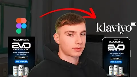
Most of our designs come out of Figma and go into Klaviyo as image slices:
- Export each section of the design as its own slice.
- Create a blank email template in Klaviyo.
- Add one image block per slice.
- Compress every slice to under 150KB, then upload.
- Write alt text for every image, using the actual words in the design.
- Link the clickable parts: buttons and products, not every image.
Two technical limits matter here. Gmail clips emails above 102KB of HTML, so we keep the total under about 85KB. And we cap emails at 8 links. Alt text isn't optional either. Spam filters flag images without it, and it's the only thing people see when images don't load.
Image-heavy emails also push against a healthy text-to-image balance, where our rule of thumb is 80% text. That's one reason we mix plain text emails into most calendars. They land in the inbox well, and for personal sends they often beat the designed version. More on the inbox side in our deliverability guide.
Watch Leon walk through it
Free on YouTube, in German.
Questions we get a lot
What size should an email button be on mobile?
At least 44px high, centered, in a color that clearly stands out from the background. Put the main button in the top third of the email.
What font size should email body text be?
16px minimum for body text and 24px or larger for headlines, with a line height of about 1.5.
How many images should a marketing email have?
As few as the message needs, each compressed under 150KB and each with alt text. Keep the whole email under about 85KB of HTML so Gmail doesn't clip it.
Should ecommerce emails use one column or two?
One. Multi-column layouts break on small screens, and more than 70% of emails get opened on mobile.